Today we are going to make a responsive sticky navbar that follows the user as they scroll down our site. It is going to be built in HTML and CSS.
The reason I am making this guide is I have just had to figure this out for my own personal developer portfolio site and I want to share it with others how to do it as I couldn’t find many free resources out there.
So let’s get started by building the basic HTML skeleton for our navbar.
Step 1: The HTML for our Sticky Navbar
First thing we need to do is create the navbar element and set up the structure so we can position the logo on the left and the links on the right.
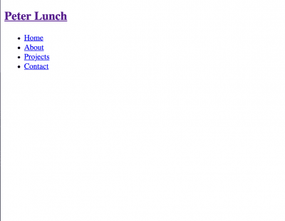
<nav class="nav">
<div class="flex-container">
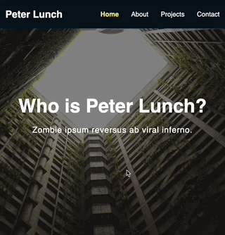
<h1 class="logo"><a href="/index.html">Peter Lunch</a></h1>
<ul>
<li><a href="#">Home</a></li>
<li><a href="#">About</a></li>
<li><a href="#">Projects</a></li>
<li><a href="#">Contact</a></li>
</ul>
</div>
</nav>Above we have created a semantic HTML navbar element. We have created a container to hold all the navbar elements in it. The first element is the H1 element which is the website's logo, the second element is the unordered list with each list element being a different link to a part of our website.
Now most of the work that goes into making the navbar functional is done using CSS. So let’s get into that.
Step 2: The CSS for our Sticky Navbar
The way we are going to work through this is from the parent container down through the children. That means we are starting with the nav class container. This is where the magic happens for the stickiness.
.nav {
  position: fixed;
  background-color: #06111c;
  top: 0;
  left: 0;
  right: 0;
  transition: all 0.3s ease-in-out;
}
The property position with the value fixed is what makes the navbar stick to the top of the page. We do this by telling it to be positioned 0 from the top of the page. Also by telling it to be 0 from the left and the right is what makes the navbar fill the horizontal space. So that’s how you do it, you can go home now...not, there is a little more to it than that.
The transition effect is going to come into play a little later but basically it is going to allow us to make the navbar's transition from one color to another appear more smoothly.

So right now all we have is an ugly black navbar. Now we need to set up our flex-container class so that our navbar is responsive.
.flex-container {
  display: flex;
  justify-content: space-between;
  align-items: center;
  padding: 20px 0;
  transition: all 0.3s ease-in-out;
}
Our navbar is now responsive. We have added padding to make the navbar less squished and appear bigger at the top of our page.
The transition effect is also the same as the previous on for our scroll effect. Next we need to make our unordered list responsive.
.nav ul {
  display: flex;
  list-style-type: none;
  align-items: center;
  justify-content: center;
}
We have made our unordered list responsive by again using flex on the element. We have also removed the dot-points on our list items and centered everything nicely. Lastly we need to style our link elements to make it pretty.
.nav a {
  color: #fff;
  text-decoration: none;
  padding: 7px 15px;
  transition: all 0.3s ease-in-out;
}
Now it is looking a lot better and if you put it on a page with your content it will stay stuck to the top.
What’s next
I recommend looking into creating an effect where when the user scrolls the navbar will change colors once the user hits a certain point on your webpage.